Marvel Rivals is crushing it in the F2P arena, but its awkward character-select UI is still a hot mess. Here’s why that matters—and why it probably won’t change.
Marvel Rivals Is Winning the Game, But Losing the Menu War
Let’s be real—Marvel Rivals is kinda eating right now. It’s one of the few live-service games that isn’t just alive but absolutely thriving, and yeah, having the Marvel logo stamped on it doesn’t hurt. But even with all that MCU muscle, there’s one thing keeping this otherwise sleek experience from feeling truly polished: the character-select screen is straight-up janky.
Now, before you say “bro, it’s just a menu,” hear me out. In a game where choosing the right hero can make or break the round, the interface actually matters. And right now? This one’s giving mid-tier mobile game energy.
The Problem: Marvel’s Character Wheel Feels Like a Puzzle Game
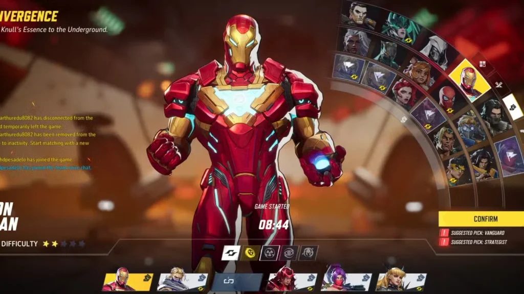
Most team-based games with hero selection—Overwatch, Apex, even OG Street Fighter—keep their character-select simple. Why? Because you want people to make choices fast and get hype, not feel like they’re solving a UI escape room.
But Marvel Rivals said, “Let’s reinvent the wheel.” Literally.
Instead of a clean grid or scrollable list, they went with a weird quarter-circle wheel. Sounds spicy in theory, but in practice? It’s a mess. Up, down, left, and right aren’t consistent, especially when the curve gets steep. Try using a gamepad and you’ll see—it’s like fighting the menu just to lock in Iron Man.
And with the roster already expanding like a Marvel multiverse plotline, having to scroll through sections in this clunky wheel is just… extra. And not in a good way.
Why It Probably Won’t Change
You’d think with all the player feedback—even from beta—that NetEase would tweak the design. But nah. It’s been months of complaints, and the wheel remains.
Here’s the thing: when a game’s still poppin’, devs tend to prioritize new content, balance patches, and bug squashing over UI complaints. Unless the menu is literally breaking the game, it’s not topping the to-do list. So even though players are annoyed, Marvel Rivals’ momentum gives NetEase little incentive to touch the UI anytime soon.
Translation: unless the player base starts revolting over it (which they won’t, because the core gameplay slaps), the awkward semi-circle menu is probably here to stay.
Could They Fix It? Totally. Will They? Probably Not.
We’re not talking rocket science here. Just give us:
- A straightforward grid layout
- Faster hero swapping
- Visuals that don’t look like a mobile port from 2012
Even a toggle option for “classic” layout vs. “stylized” would be enough. But right now, it feels like a case of creative vision overriding player comfort. And hey, devs deserve to be bold—but not when bold = confusing.
The Bottom Line
Marvel Rivals is a genuinely fun, fast-paced F2P hit. The gameplay’s tight, the roster is stacked, and fans are hooked. But that character-select screen? Absolute L. It’s clunky, confusing, and just doesn’t vibe with the rest of the game’s polish.
If NetEase ever decides to give the UI a makeover, we’ll be first in line to celebrate. But until then, we’ll be squinting at diagonally placed hero icons and wondering why something so basic had to be so complicated.
Pro Tip: Just pick your main early and stick to it. Navigating that menu under time pressure is pain.
Also check:
Grounded 2 Is Coming – And Xbox Is Giving Away a 10-Foot Red Ant Plush to Celebrate
Pokémon Champions: A PvP Powerhouse That Lets You Train Like Never Before
GTA 6 Rumors Point to Custom Music Mode and PS5 Pro 60 FPS Support